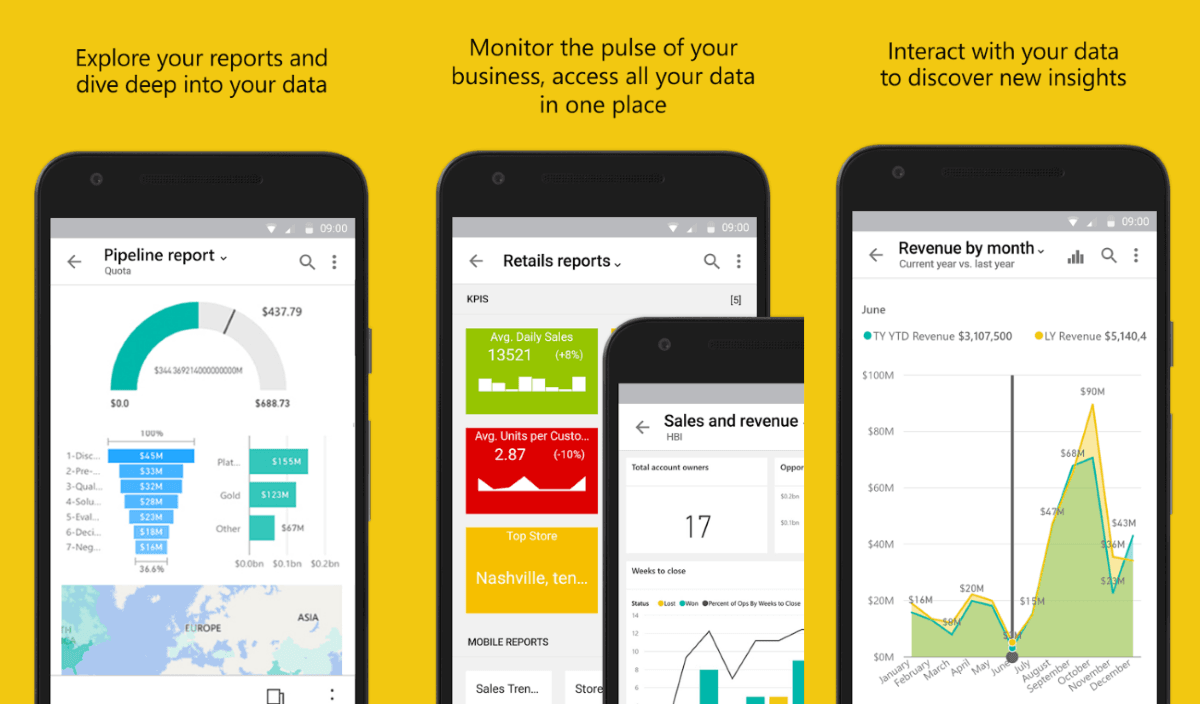
Power BI Mobile provides the tools users need to stay connected to their data, wherever business takes them. But, as organizations grow, we understand that it’s increasingly difficult for Power BI users to discover and manage the content that matters to them on the go. It’s important for us that our users are able to find exactly what they need quickly and easily when they’re using the Power BI mobile app to view and interact with their content.
Today, we’re excited to announce the public preview of the “new look” now available on Power BI Mobile. We’ve refreshed our app and introduced new experiences, adding a home page that provides quick access to your commonly used content and includes your organization brand theme, and new navigation bars that give you an easy way of navigating through the app. With the new and refreshed experiences, it’s now quicker and easier to find what you need, when you need it.

Since we’re previewing the new look, you’ll need to opt in and turn it on in the mobile app. Once you do that, the app will display several new features:
-
- Home page
-
- Organization branding
- Navigation bar
Sounds exciting? Continue reading the rest of the blog to learn more about the new experience.
Can’t wait? You can turn on the new look from the app banner or side panel to start enjoying the new home and navigation options.


