5 Power BI Dashboard Mistakes That Are Costing Your Business Time
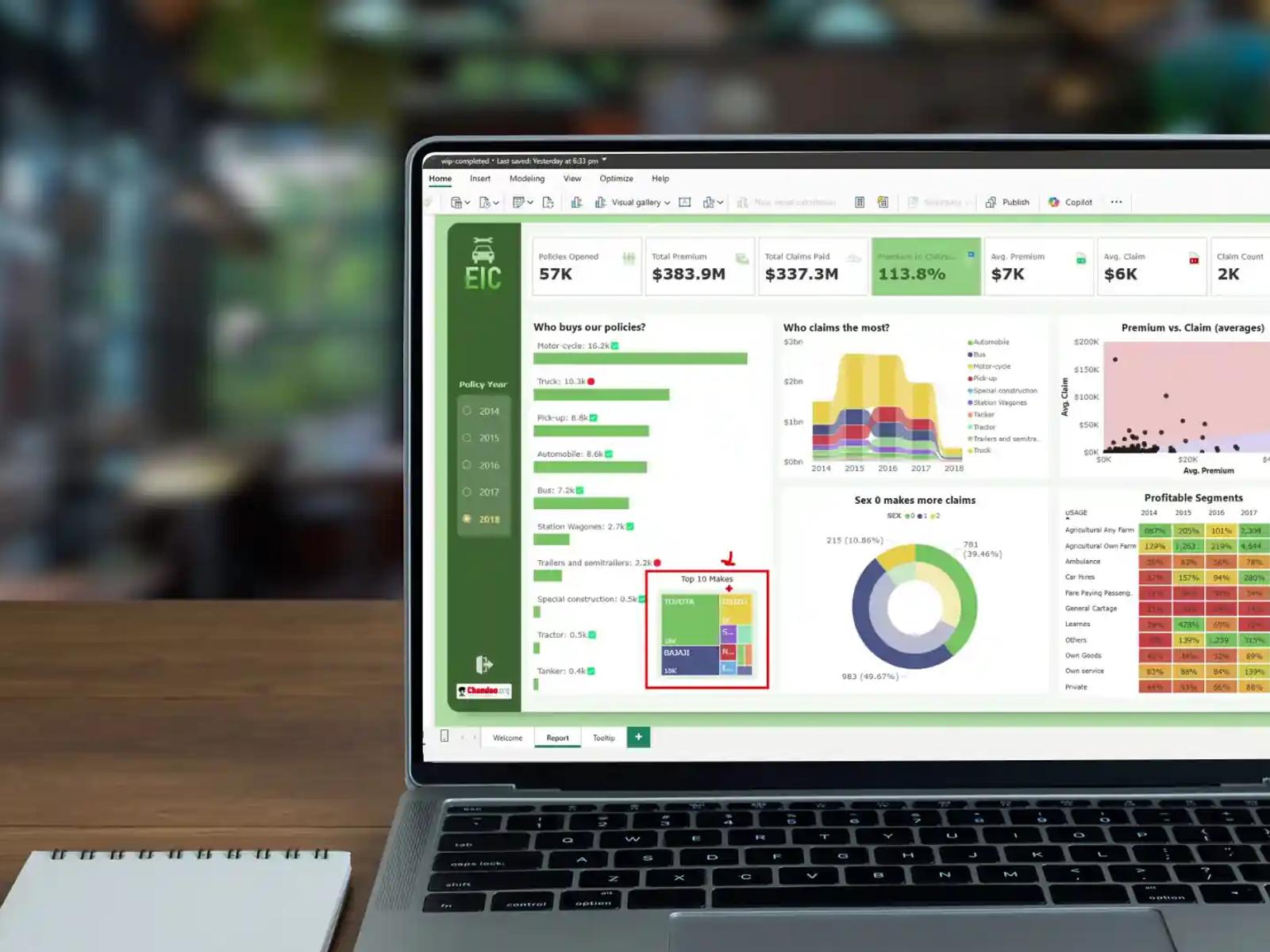
Most organisations are sitting on a goldmine of data but undermining their own dashboards with these five avoidable design and logic errors.
Data is only as valuable as the speed at which it can be interpreted. In 2026, the volume of information available to the average enterprise is staggering, yet many leadership teams still find themselves waiting for reports to load or squinting at charts to find a single relevant figure.
When a Power BI dashboard is built poorly, it doesn’t just look bad: it actively drains your team's time. Here are the five most frequent errors we see in corporate reporting environments and how to fix them.
1. Overloading the "Single Pane of Glass"
There is a common temptation to cram every possible metric into one page. The result is a dashboard that suffers from high cognitive load. When a user is presented with 15 different cards, three maps, and four bar charts at once, they spend more time trying to find the "point" than they do making decisions.
The Fix: Use a "Summary to Detail" architecture. Build a landing page with three or four high-level KPIs. Use drill-through actions or tooltips to allow users to investigate specific data points without cluttering the main view.
2. Inefficient DAX Logic
Logic errors are often invisible until the dataset grows. Calculations that work perfectly on 1,000 rows can ground a dashboard to a halt when they have to process 10 million rows. Using complex, nested measures where a simple calculated column or a change in the data model would suffice is a primary cause of slow report performance.
The Fix: Move as much logic as possible "upstream." If a calculation can be handled in the SQL database or via Power Query before it reaches the dashboard, handle it there. Keep your DAX measures lean and focused on aggregations.
3. The "Everything is a Pie Chart" Problem
Visual choice is not just about aesthetics; it is about communication. Pie charts are notorious for being difficult to read when there are more than three categories. Similarly, using a line chart for categorical data rather than time-series data confuses the narrative.
The Fix: Match the visual to the goal.
- Bar Charts: For comparing categories.
- Line Charts: For showing trends over time.
- Cards: For single, critical numbers. If a visual requires a user to hover over every section to understand the scale, it is the wrong visual for that data.

4. Ignoring the "Actionable" in Analytics
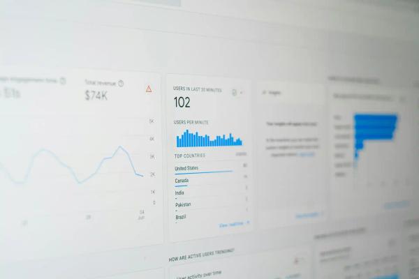
A common mistake is building "What" dashboards rather than "Why" or "Now What" dashboards. A chart that shows sales went down last month is interesting, but it isn't useful unless it points to the reason or the solution.
The Fix: Incorporate benchmarks and goals. Instead of just showing a total, show that total against a target or a previous year's performance. Use conditional formatting (like red/green indicators) to draw the eye immediately to the areas that require intervention.
5. Neglecting Data Governance and Refresh Cycles
Nothing kills the utility of a dashboard faster than a lack of trust. If two different departments look at two different dashboards and see two different "Total Revenue" figures, the data becomes useless. This often happens due to "siloed" datasets or inconsistent refresh schedules where one report is updated daily and another is updated weekly.
The Fix: Establish a "Single Source of Truth." Use shared datasets across the organisation so that everyone is working from the same definitions and the same refresh schedule. This ensures that meetings are spent discussing strategy rather than arguing about whose numbers are correct.
The Performance Audit
| Mistake | Impact | Recovery Time |
|---|---|---|
| Visual Clutter | High Cognitive Load | Immediate (Redesign) |
| Poor DAX | Slow Load Times | Medium (Optimisation) |
| Weak Governance | Loss of Data Trust | Long (Restructuring) |
A Power BI dashboard should be a tool for clarity, not a source of confusion. By focusing on clean design, optimized logic, and consistent data governance, you turn your reporting from a time-sink into a high-velocity engine for growth.
Since we are discussing dashboard efficiency, would you like to explore how to set up a "drill-through" strategy that keeps your high-level executive views clean while still allowing for deep-dive technical analysis?

Ready to transform your business?
Let's discuss how our expert Data Analytics solutions can drive measurable growth for your organization.
Schedule a Consultation