Best Practices for Using Colour in Data Visualizations
Colour has been shown to have a small yet direct effect on human biology and psychology. Color also affects the way our brains process information. Using colour strategically can increase memory, aid pattern recognition, and attract attention to priority information.
Colour can be a powerful tool for data visualization. In this post, we’re looking at the best practices you can implement to make your data visualizations more effective.
Why colour use in data visualization matters
The use of colour in data visualization is important because it helps viewers quickly digest information and remember it. Colour is one of the easiest design principles to apply to data visualization because it can be used strategically to communicate meaning and impact. Using colour strategically helps viewers understand the meaning and impact of the information presented and remember the most important details.
Poorly chosen colours can distract viewers from the message of a visualization. Let’s dive into some best practices for choosing colours in order to aid comprehension.
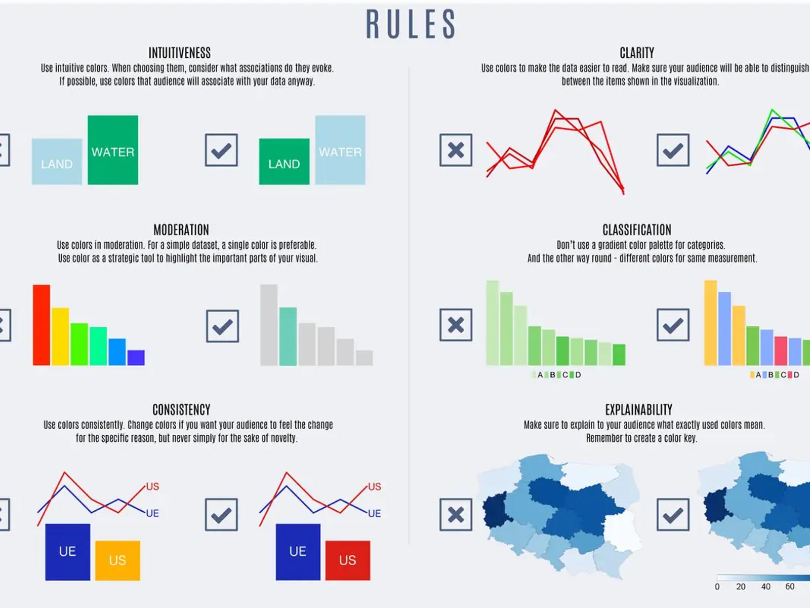
INTUITIVENESS – Use intuitive colours. When choosing them, consider what associations do they evoke. If possible, use colours that audience will associate with your data anyway.
CLARITY – Use colours to make the data easier to read. Make sure your audience will be able to distinguish between the items shown in the visualization.
MODERATION – Use colours in moderation. For a simple dataset, a single colour is preferable. Use colour as a strategic tool to highlight the important parts of your visual.
CLASSIFICATION – Don’t use a gradient colour palette for categories. And the other way round – different colours for same measurement.
CONSISTENCY – Use colours consistently. Change colours if you want your audience to feel the change for the specific reason, but never simply for the sake of novelty.
EXPLAIN-ABILITY – Make sure to explain to your audience what exactly used colours mean. Remember to create a colour key.
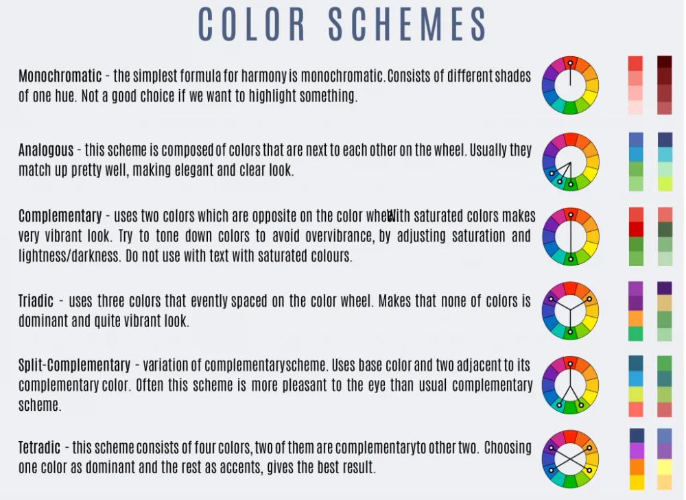
There is no single, right way to use colour in design, but by understanding how the brain processes colour and applying that knowledge, we can get better results.
As with all design used for communication, good data visualization design harnesses common conventions and uses them as shorthand. For the same reason that UX designers always use a cart icon to indicate the button e-commerce shoppers should click to complete a purchase, data visualization designers use colours to trigger associations and streamline understanding. For example, you may use orange to represent safety performance, deep green to represent profit, or light green to represent environmental sustainability. Colour palettes can also create associations in the viewer’s mind, such as the colours of a country’s flag communicating data related to that country.
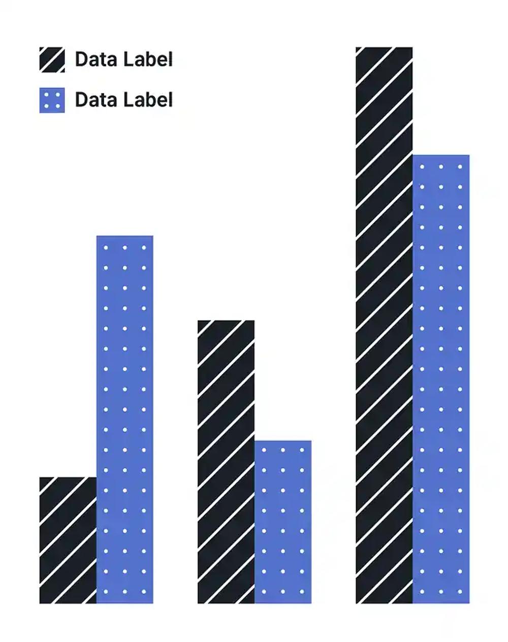
Not everyone has the same visual ability. A broad array of colour vision deficiencies may affect a person’s ability to distinguish between certain colours. While accessibility is a big subject with many considerations, you’ll want to be aware of the colours and hues that may cause issues for people with visual challenges.
For example, it can be difficult to tell the difference between orange and green when viewed by someone with protanopia, a type of colour blindness. In such cases texture can help like this graph below
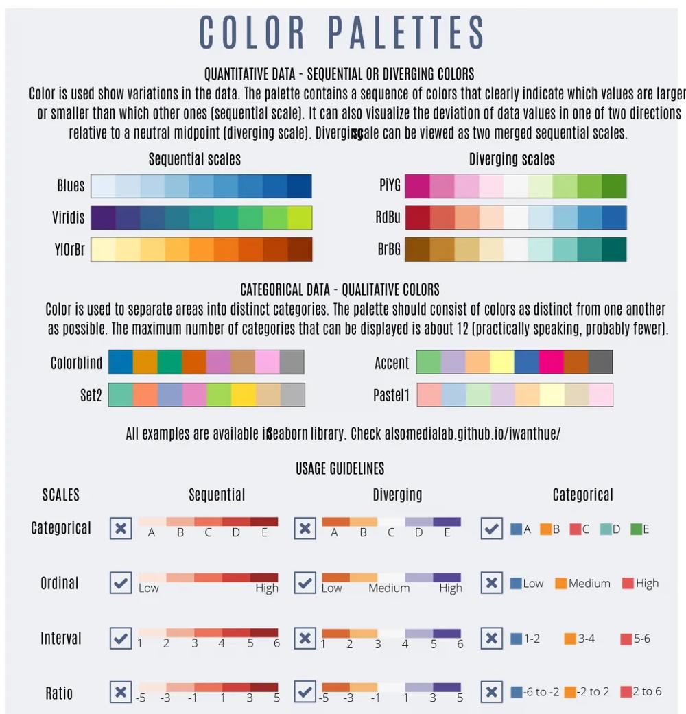
Qualitative — Qualitative palettes are those in which each colour is distinct from the others. This type of palette is ideal for visualizations displaying categorical variables, those that are unrelated to one another.
Sequential — Sequential palettes use a single colour in a variety of saturation or a gradient. A sequential palette clearly communicates information in ordered, numeric values, such as dollar amounts over time.
Diverging — A diverging palette shows where variables sit on a spectrum, such as cold to hot. This palette reflects the data by using one colour on one end of the spectrum and a different colour on the other end, with a neutral colour in the centre. The colours in between the neutral centre and end of each spectrum are gradients in between neutral and the end colour (usually light to dark) on either side.
PROTIPS
- The colour grey is the most important colour in data visualization.
- The use of colour should always be an intentional decision.
- Never let your tool make this important decision for you!
- After creating your visualization, close your eyes and then look back at it, taking note of where your eyes are drawn first. Is it where you want your audience to focus?
- When picking colours consider the connotations colors have in other cultures. You can check: informationisbeautiful.net/visualizations/colours-in-cultures
- Remember about colour deficiency issues (colour blindness). You can check: projects.susielu.com/viz-palette


Ready to transform your business?
Let's discuss how our expert Data Analytics solutions can drive measurable growth for your organization.
Schedule a Consultation