The ROI of Data Visualization: Turning Spreadsheets into Strategy
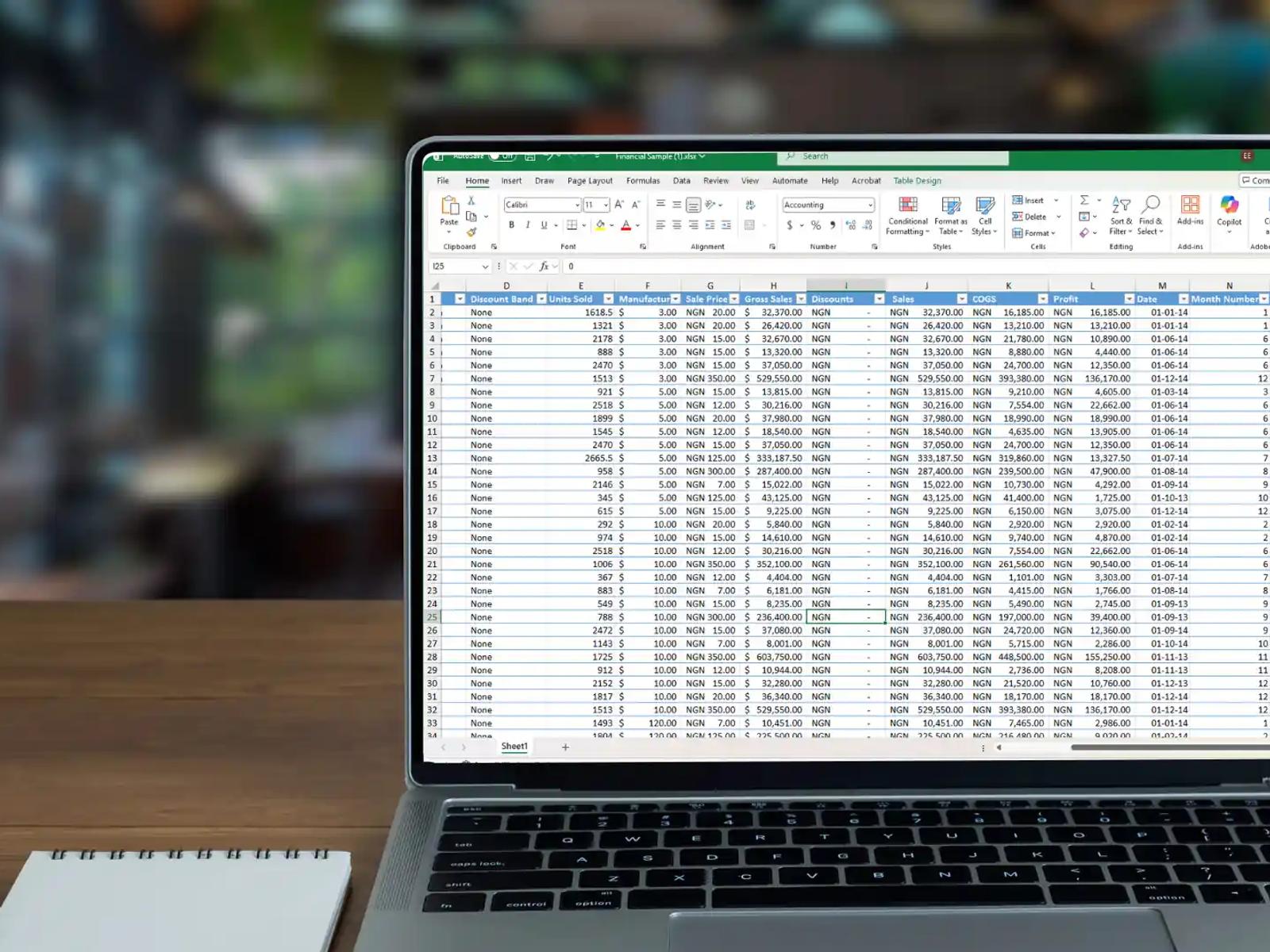
Stop presenting raw data to your board. Learn how adopting Tableau and Power BI can accelerate executive decision-making by 40%.
In high-stakes corporate environments, the most expensive resource is an executive’s time. Yet, many organizations still walk into board meetings with dense spreadsheets and hundreds of rows of raw data. This approach forces leadership to act as data analysts rather than strategists.
The shift toward sophisticated data visualization is not about making charts look pretty. It is about a fundamental change in how a business processes information. When you move from static tables to dynamic platforms like Tableau or Power BI, you are investing in clarity, speed, and accuracy.
1. The Speed of Visual Cognition
The human brain is wired to process visual information significantly faster than text or numbers. While it might take several minutes to identify a downward trend in a spreadsheet, a well-designed line chart reveals that same trend in a fraction of a second.
This efficiency is where the "40% acceleration" in decision-making comes from. By removing the mental heavy lifting required to parse rows of data, executives can move straight to the "why" and the "how." In a volatile market, the ability to see a shift early and pivot accordingly is the ultimate competitive advantage.
2. Identifying Hidden Risks and Opportunities
Raw data often hides the very things a board needs to see most: outliers and correlations. A spreadsheet might show that revenue is up, but a visual dashboard can simultaneously show that customer acquisition costs are rising at a dangerous rate in one specific region.
In the context of Governance, Risk, and Compliance (GRC), visualization acts as an early warning system. It allows leadership to spot anomalies or compliance gaps before they escalate into systemic failures. By mapping data points against benchmarks, you turn a retrospective report into a forward-looking strategy.
3. Creating a Single Source of Truth
One of the biggest obstacles to revenue growth is internal friction caused by conflicting data. When different departments bring different versions of the truth to the table, meetings devolve into arguments over whose numbers are correct.
Adopting enterprise-grade tools like Power BI or Tableau allows a firm to centralize its data management. When the board looks at a dashboard, they are seeing a unified view of the company’s health. This alignment ensures that every strategic move is based on the same verified facts, reducing the risk of fragmented execution.
4. The Aesthetic of Authority
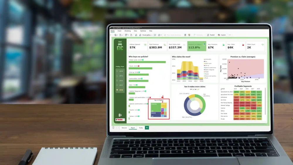
There is a psychological component to how data is presented. A cluttered, poorly formatted report suggests a cluttered, poorly managed process. Conversely, a minimalist, high-performance dashboard communicates precision and control.
High-end visualization should follow a "functional aesthetic." Every element should serve a purpose, using motion and layout to guide the viewer’s eye to the most critical KPIs. This level of polish does more than just present data; it builds confidence in the leadership team’s ability to manage complex operations with surgical accuracy.
5. From Reporting to Interaction
The true ROI of modern BI tools is interactivity. In a traditional board presentation, if a director asks a "what if" question, the answer usually has to wait for the next meeting.
With dynamic dashboards, you can filter, drill down, and toggle variables in real time. This allows the board to test hypotheses on the fly. This level of agility transforms a static presentation into a collaborative strategy session, ensuring that the final decision is thoroughly vetted against the data.
Strategic Comparison: Spreadsheets vs. Visual BI
| Metric | Traditional Spreadsheets | Visual BI (Power BI/Tableau) |
|---|---|---|
| Data Processing | Manual and slow | Automated and real-time |
| Insight Discovery | Requires deep analysis | Immediate pattern recognition |
| Risk Detection | Reactive (Found late) | Proactive (Visual alerts) |
| Decision Speed | Days or weeks | Minutes or hours |
Data is a goldmine, but only if you have the tools to refine it. By moving away from raw spreadsheets and embracing high-fidelity visualization, you empower your board to stop looking at what happened and start deciding what happens next. The return on investment isn't just in the software; it is in the clarity of the vision you provide to your leadership.

Ready to transform your business?
Let's discuss how our expert Data Analytics solutions can drive measurable growth for your organization.
Schedule a Consultation