The Strategic Concept
1. Heavyweight Rounded Display Typography
The wordmark utilizes a thick, customized, rounded display typeface. This structural choice serves an operational purpose: extreme legibility and high visibility. Because a distribution business relies on mobile assets (delivery trucks, vans, crates, and warehouse signage), the font needs to be instantly readable from a distance and under various lighting conditions. The soft, rounded edges strip away corporate coldness, making the brand feel approachable to local shop owners and retailers.
2. The Tropical Monstera Canopy
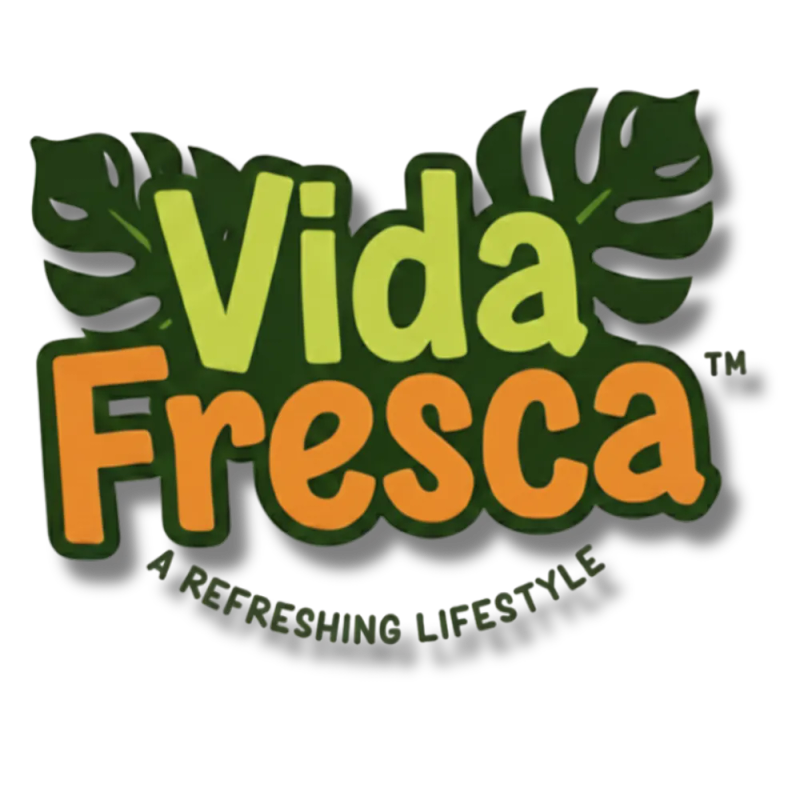
Framing the top of the wordmark are two stylized Monstera (split-leaf philodendron) leaves. This choice shifts the narrative from mechanical "transportation" to organic "vitality and lifestyle." The leaves establish an immediate association with cold refreshment, nature, and tropical energy—essential cues for a business specializing in beverages.
3. The Shield Container & Contrast Layering
The entire logotype is anchored within a deep forest-green organic container shape.
- The Boundary: The dark green container pulls the lime green and orange text forward, creating an intense contrast lockup that prevents the logo from getting lost on complex backgrounds.
- The Shadow Baseline: A subtle dimensional shadow elevates the block, giving it weight and presence suitable for physical application on uniform apparel, delivery trucks, and business collateral.
- The Curved Tagline: Grounding the emblem is the curved tagline, "A REFRESHING LIFESTYLE." It changes the pitch from a raw utility service to a premium partner that enhances social gatherings and everyday retail experiences.
The Colour Psychology
The palette is deeply rooted in flavour and sensory association:
- Fresh Lime Green: Used for "Vida," directly evoking crispness, citrus, and cold refreshment.
- Vibrant Orange: Used for "Fresca," a warm colour that stimulates energy, enthusiasm, and thirst.
- Deep Forest Green: Used for the background shield and leaf silhouettes, providing stability, grounding the brighter tones, and representing structural endurance.
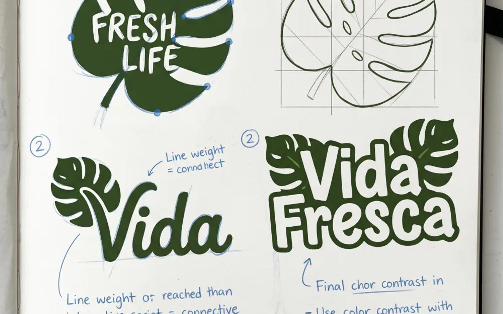
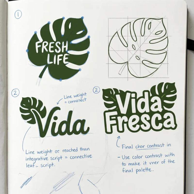
Phase 1: Conceptual Sketch & Geometric Definition
The process begins not on a screen, but in a physical design journal. In this initial phase, the core strategic concepts are deconstructed and iterated visually.
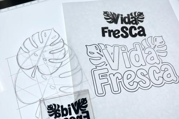
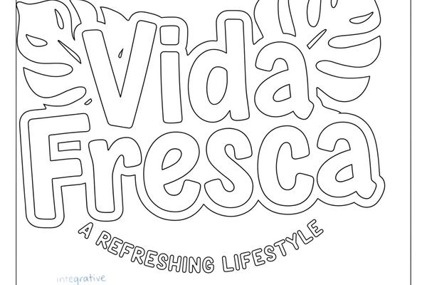
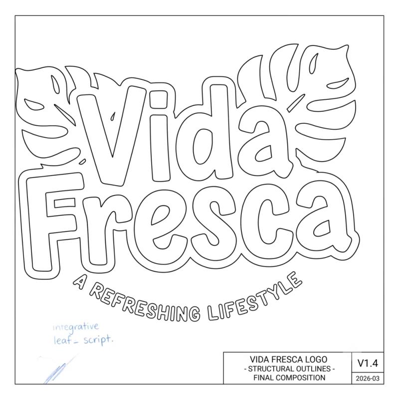
Phase 2: Structural Outlines & Vector Blueprint
With the visual logic defined and the 'DNA' established, the process shifts to translating those conceptual sketches into rigid, high-fidelity vector data.
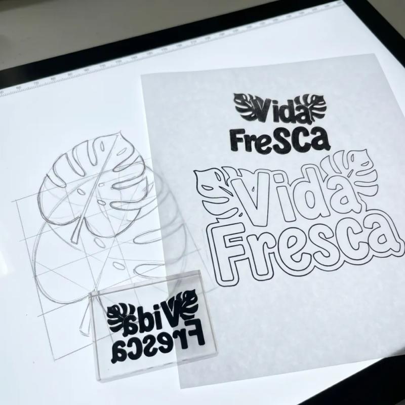
Phase 3: The Moment of Fusion
Now that we have established the conceptual direction and the technical outlines, the core design challenge is to visualize the moment of their integration.
Phase 4: Final Polishing & Production Rendering
The final step takes the fused composition (from Image 3) and applies the precise colors, textures, and dimensional attributes defined in the original
The Result
The final identity system gives Vida Fresca a significant competitive advantage over unbranded regional competitors. It moves the conversation away from a race-to-the-bottom on price by presenting the distributor as a highly organized, professional brand entity. The look translates perfectly into high-visibility signage across Ibadan, building immediate trust with both retail business partners and individual event hosts.
Project Gallery
Click any image to view full screen.

Ready to start a similar project?
Let's discuss how our expert Branding solutions can drive measurable growth for your organisation.
Start a Conversation