The Strategic Architecture
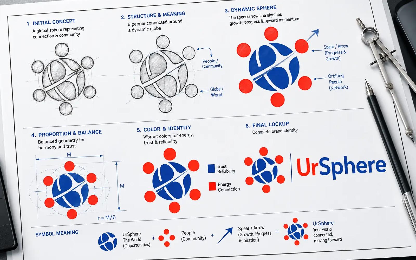
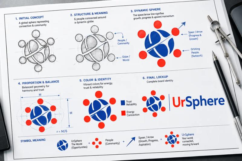
As showcased in the primary brand sheet, the visual assets were built upon a rigid geometric grid to ensure clean execution across digital apps, transit delivery boxes, and favicon scales.
1. The Central Sphere (Total Aggregation)
The core emblem features a central sphere segmented by fluid vector paths. This connotes global access, connectivity, and a structural multi-faceted framework. Rather than a solid, static circle, the internal curves suggest diverse compartments working in sync. This represents the absolute unification of varied services, groceries, apparel, data logistics, and insurance under a single, secure domain.
2. The Orbital Node Network
Surrounding the perimeter of the globe are six symmetrically placed circular nodes forming an outer satellite loop. This architecture serves two major strategic intents:
- The "One-Place" Guarantee: The outer nodes reference peripheral services constantly orbiting and feeding into the central user experience.
- The Ecosystem Expansion: It moves the brand away from traditional, flat shopping cart iconography, reframing UrSphere as an expansive tech ecosystem that simplifies all consumer touchpoints.
3. Wordmark Contrast Logic
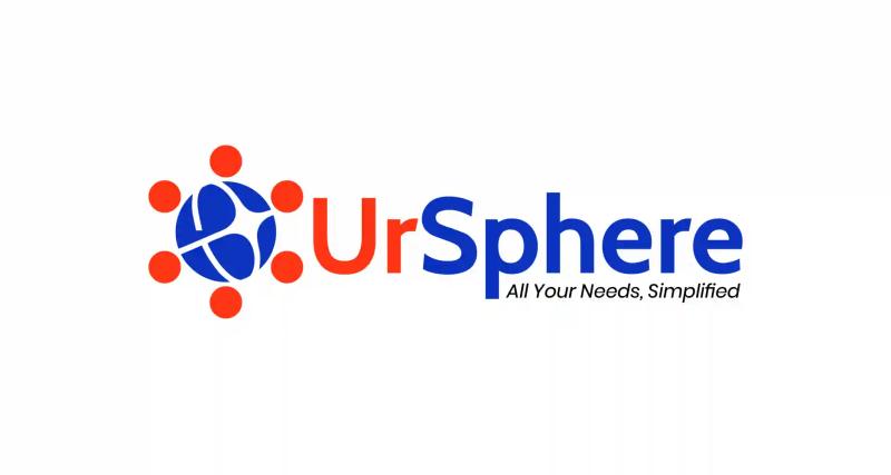
The main wordmark clearly displays a technical split between the consumer and the destination:
- "Ur" [The Personal Persona]: Set in highly vibrant orange-red, representing the active, energetic, human-centric focus of everyday retail.
- "Sphere" [The Corporate Infrastructure]: Set in deep, commanding corporate blue to project stability, security, and scale, critical traits required when handling transactions.
- The Anchor: Positioned cleanly beneath the layout is the slanted italic tagline:
All Your Needs, Simplified. This serves as a structural base, grounding the bold presentation font with a thin, approachable customer promise.
The Colour System
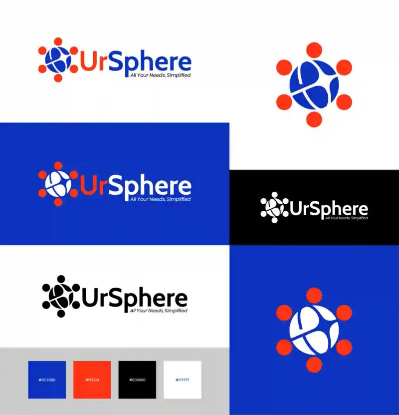
The palette, mathematically defined on the brand guide canvas, leverages complementary vibrancy to establish distinct brand spaces:
- Ecosystem Blue: The stabilizing anchor colour. This deep hue represents trust, data privacy, and financial security, essential for long-term lifestyle and insurance procurement.
- Vibrancy Red: The conversion driver. It acts as an urgent, energetic retail tone, stimulating immediate action and connecting with consumer logistics like on-demand grocery delivery.
- System Tones: High-contrast absolute neutrals to ensure flawless readability across responsive dark-mode application frames and print collateral.
The Result
The final visual asset engine for UrSphere establishes an authoritative digital identity that easily adapts to future product vertical expansion. The bold contrast layout performs efficiently on low-resolution mobile layouts and physical packaging alike. By balancing consumer energy with corporate structural security, the logo anchors UrSphere not merely as a digital marketplace, but as a lifestyle utility hub.
Project Gallery
Click any image to view full screen.

Ready to start a similar project?
Let's discuss how our expert Branding solutions can drive measurable growth for your organisation.
Start a Conversation