The Strategic Architecture
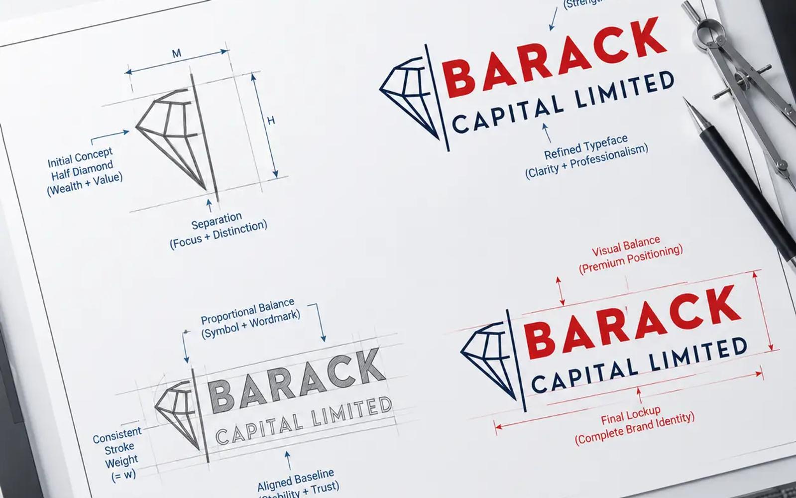
As visible in the master corporate mark layout, the logo uses a highly intentional two-zone architecture divided by a rigid structural grid.
1. The Subtractive Geometric Half-Diamond (Wealth & Strategy)
The centrepiece of the visual identity is the clean wireframe cut of a half-diamond.
- The Psychology: A diamond is the universal signature of absolute wealth, permanence, and premium status. By displaying it as a technical, multi-faceted wireframe, the logo moves away from shallow luxury to connote data precision, risk engineering, and structural transparency.
- The Half-Cut Logic: Using an exact vertical slice along the centre axis introduces an asymmetrical, modern architectural look. It suggests a firm that looks forward into future market cycles rather than relying on legacy templates. The converging facets meet at precise vertices, illustrating the synthesis of multiple distinct investment tracks (Private Equity, Wealth Management, and Corporate Finance) into one unified apex.
2. The Bounding Anchor Line
A sharp, weighted vertical separator line stands directly between the icon and the typography blocks. This is an explicit nod to Risk Mitigation and Governance Boundaries. In elite financial operations, clear boundaries represent protection, containment, and strict alignment with compliance frameworks. It functions as a structural column that anchors the entire visual lockup, balancing the dynamic lines of the icon with the absolute stability of the text layers.
3. Typographic Split & Colour Staging
The corporate text fields utilize a commanding sans-serif matrix that divides focus with surgical intent:
- "BARACK" [The Market Dominator]: Set in a bold, high-visibility, solid geometric uppercase font. It is flooded with an intense corporate red to signal market dominance, action, and high-velocity capital growth.
- "CAPITAL LIMITED" [The Institutional Base]: Positioned cleanly beneath the primary text field, this block uses an elongated, wider tracked layout. Set in an unyielding deep navy blue, it grounds the layout, projecting corporate permanence, sovereign trust, and absolute confidentiality.
The Design Evolution Breakdown
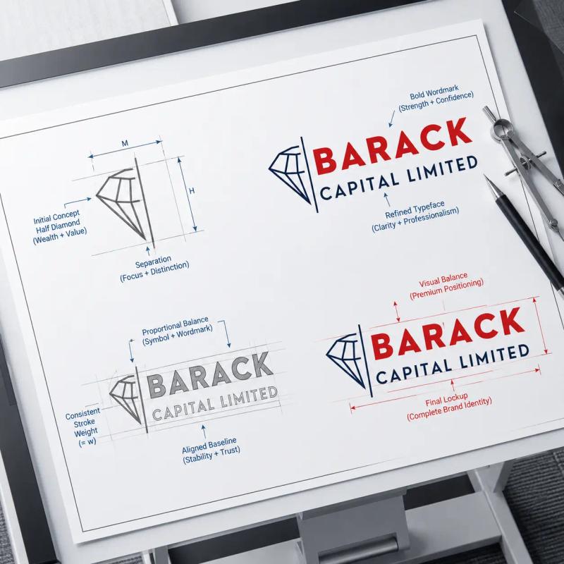
The generated master progression sheet outlines the exact step-by-step engineering log behind the composition:
- Stage 1: Facet Mapping & Radial Balancing: The project starts with a perfect, multi-faceted symmetrical diamond template mapped inside an exact geometric circle to establish visual weight, proportions, and perimeter boundaries.
- Stage 2: Subtractive Split & Axis Definition: A precise vertical dividing vector is applied to the centre of the diamond grid. The right profile lines are systematically faded out, isolating the left half-diamond vector structure to introduce an asymmetrical, high-end modern layout.
- Stage 3: Structural Pairing & Grid Boundaries: The half-diamond mark is locked directly against a weighted vertical separator line. Clean, mathematical bounding boxes are placed on the right to define the precise spatial real estate and padding thresholds required for the corporate text fields.
- Stage 4: Master Production Release: The final visual asset is rendered into its finished state, with full colour profiles locked into the vectors (Ecosystem Red and Deep Corporate Navy), creating an authoritative, elite financial mark ready for international application.
Project Gallery
Click any image to view full screen.



Ready to start a similar project?
Let's discuss how our expert Branding solutions can drive measurable growth for your organisation.
Start a Conversation