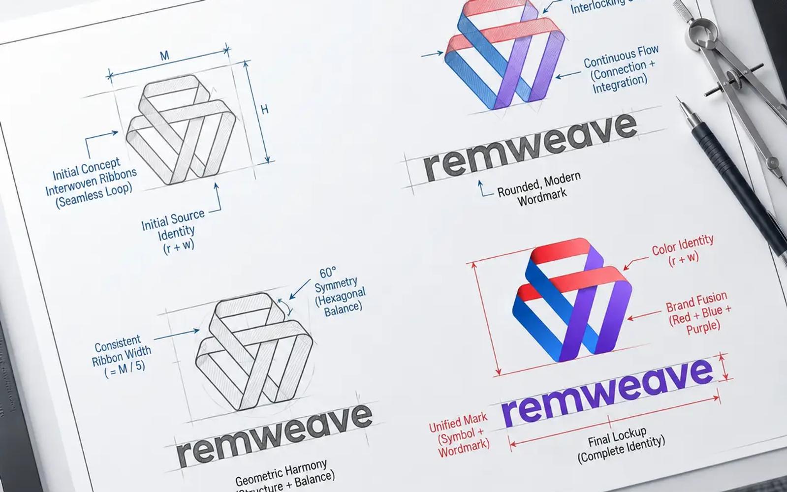
1. The Naming Matrix & Strategic Intent
The brand name Remweave is a calculated fusion of fundamental layout mechanics and artistic orchestration. The identity design bridges two core pillars:
- "rem" (Root EM): In modern responsive web development,
remis the definitive relative CSS unit used to scale typography and layout grids cleanly across fluid device viewpoints. It stands for pixel-perfect foundation, responsiveness, and algorithmic precision. - "weave": This represents the multi-disciplinary craft of intertwining code syntax, typography frameworks, design systems, and identity assets into a single, cohesive, high-conversion digital product.
2. The Core Icon: An Homage to Democratic Web Access
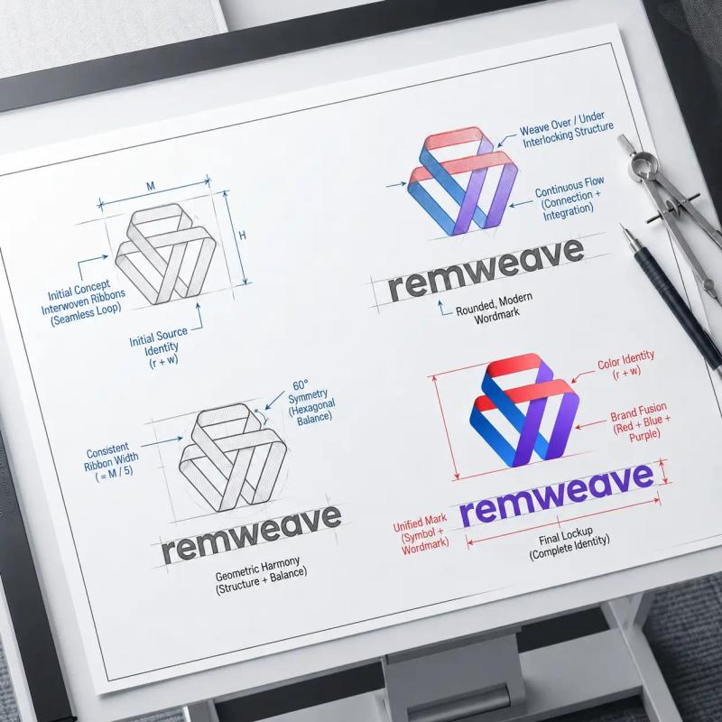
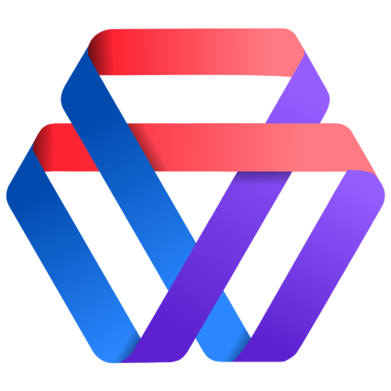
As displayed in the primary mark is a continuous, interlocking woven ribbon forming an isometric loop.
This geometry is a direct design play and homage to Macromedia/Adobe Dreamweaver one of the foundational pioneers that democratized early desktop access to the web, shifting development from pure source text into visual layout environments. By referencing this digital lineage, the mark positions Remweave not merely as a temporary startup, but as a knowledgeable custodian of internet culture and development history.
The three distinct ribbon segments wind over and under one another in a single loop, visually mapping the overlapping execution of Remweave's primary workflows: Design Strategy, Frontend Code, and Performance Optimization.
3. Colour Spectrum & Typographic Staging
The identity’s colour theory and typography balance high creative energy with software engineering standards.
The Colour Palette Profile
- Deep Amethyst Purple: Dominates the primary typography and structural base layers. It represents premium positioning, digital maturity, and absolute corporate security.
- Electric Cyber Blue: Floods the lower track of the icon ribbon to ground the symbol in technological competence and clean backend infrastructure.
- Vibrant Neon Coral/Red: Loops across the top apex of the icon, introducing a shock of high-impact visual contrast that mimics code compilation signals and creative vitality.
Typography Configuration
The wordmark "remweave" is executed entirely in lowercase using a heavy, ultra-stabilized geometric sans-serif typeface. Choosing lowercase layout elements frames the agency as approachable, agile, and intrinsically digital-native. The wide tracking and thick stem weights guarantee that the wordmark retains clear legibility when scaled down to ultra-low resolutions, such as site icons, app headers, and favicons.
Brand System Readout
| System Parameter | Identity Specification | Strategic Value |
|---|---|---|
| Primary Wordmark Typography | Customized Low-Case Geometric Heavy Sans | Promotes modern accessibility and retains thick legibility matrices down to micro-resolutions. |
| Core Structural Symbol | Continuous Hexagonal Subtractive Ribbon | References Dreamweaver's historical web democratization while symbolizing multi-disciplinary work fusion. |
| Corporate Base Colour | Deep Amethyst Purple | Replaces generic corporate blues to position the agency at an elite, specialized creative tier. |
| Velocity Accents | Electric Blue to Neon Coral Gradients | Reflects rapid code execution, high interface interactivity, and modern software development cycles. |
Project Gallery
Click any image to view full screen.


Ready to start a similar project?
Let's discuss how our expert Branding solutions can drive measurable growth for your organisation.
Start a Conversation